Nordisk Filmbiografer

ux research + guerrilla testing + wireframing

A graph that shows that young adults go to the cinema more than other age groups

Table of contents

Introduction

I am a huge movie geek, and I always felt like there was something romantic about going to the cinema. That sense of romanticism, however, has been tarnished a bit over the years, as I have grown frustrated with a few of the things I now have come to associate with the movie-going experience: the exceedingly high cost of candy, and a clunky, sub-optimal website experience.

In this project, I attempt to use research and proven design theory to identify real usability issues and pain points on a live, cinema website. This was my very first real design project, so a lot of the techniques and software that I used, I had to teach myself along the way. At the very end of this case study, I reflect upon the most important lessons this project has taught me.

In case you want to skip the case study, click here to see the prototype.

Research

Since I had no direct access to any of the company’s data, I had to get creative.

Preliminary research

Nordisk Film Biografer is the largest chain of cinemas in Denmark, and owns 22 different cinemas, spread out across the country. The cinemas receive about 6 million visitors annually, in total. Their website gets about 513.000 views per month. Kino.dk, which is a ticket hub for 49 Danish cinemas, including the cinemas from NFbio.dk, gets about twice as many views. Kino.dk also offers ticket sales to Nordisk Film Biografers showings, but I have no way of knowing which of the two sites sell more tickets on Nordisk Film Biografers behalf.

The information I managed to scrape together was scarce and dated. The graph below is from a cultural survey (conducted once every 10 years) from 2012. It tells me that teens and young adults are the primary movie-goers. A graph that shows that young adults go to the cinema more than other age groups

Nordiske Film Biografer was not willing to share much when I contacted them either, unfortunately, but I had not expected that they would.

The Guerilla Test

In order to learn more about how people interacted with the website, I wanted to conduct a usability test. Due to a lack of resources (both in time, manpower and funds), I decided to conduct a guerrilla test. This is an alternative to doing a full usability test, which comes with its own pros and cons. The key difference lies in how people are recruited for the test. In a traditional usability study, people are recruited in advance, for long (45 minutes - 1 hour) sessions. This allows for depth and rigor. The guerrilla version takes place in public, where people are recruited for short, on-the-spot sessions.

The most important difference is arguably that you rarely get to test with people who resemble your users. If time had permitted, I would rather have done a more thorough test for this very reason.

Purpose: The test included just the mobile version of the current (as of date of test) website. The test focused mostly on navigation, as required by the different tasks.

Scope: The purpose of the test was to locate as many possible pain points as possible that may create friction in the flows related to the most common user goals. Secondarily, observing people interact with the current design would give me valuable insights into the user.

Length: 15 minutes, max. Because I approached people during shopping, I knew that even 15 minutes would be stretching it.

Participants: Anyone with a smartphone, who reported having been to the cinema within the last two months.

Metrics: Due to the relative small scale of the project and small group of participants, the things I payed attention to were mostly qualitative. I payed particular attention to user pain points, critical errors and task completion rates.

In preparation of the test, I wanted to figure out what users wanted to accomplish when visiting the website. I made a survey on social media, asking what people usually went to cinema sites to do.

The three goals that were mentioned the most were:

1: To see what movies are showing this week.

2: To see the show times on a particular date.

3: To see which movies are coming out in the near future.

4: To order a ticket, knowing already what they want to see and where.

I used these three goals as the core focus for my usability test and to limit the scope of my redesign. In order to run a test with these goals, I had to rewrite them into tasks, and then build up scenarios around each task. Note that these scenarios were written and executed in Danish, but that the translated versions below match the phrasing and tone fairly well. I was careful to phrase the scenarios in such a way that the words did not match any navigation elements on the cinema website.

Exploratory task: This is the website. First, I would like you to look around and tell me your impressions. What do you think is possible on this site? You can scroll up and down, but please stay on this page to begin with.

Scenario 1: You want to go to the movies, but haven’t decided on which movie to watch. You plan to go to the cinema this Sunday night. The closest cinema to you is in the Field’s shopping mall, in Copenhagen.
Find out which movies are showing on Sunday (the 10th).

Scenario 2:You and your two friends are talking about watching the movie “Baby Driver”. You agree to go to the cinema on Wednesday the 13. Of September, at around 20:00. You decide to go to the cinema located in Kennedy Arkaden, Aalborg.
Reserve three (3) tickets for the movie “Baby Driver” on the 13. Of September at around 20:00 at the cinema in Kennedy Arkaden, Aalborg.

Scenario 3: There aren’t really any movies currently showing that you want to see. You figure you’ll look ahead a little, to see what is coming out later.
Find out which movies are coming out in October.

In order to record the sessions, I constructed a DIY “Brundlefly”, as coined by Steve Krug, from a universal phone holder, a webcam and duct tape. Want to see how I made it?

A picture of a homemade device for capturing video of people when they use a smartphone.

Location

My initial idea was to conduct the test on moviegoers at the local cinema, but that didn't pan out. Instead, I convinced a local grocery store to let me hang out in their wine aisle. I had to turn up the charm and work hard to get participants, because people don't "hang around" at grocery stores. They are there to complete a specific task, and then leave.

A picture of my setup at the local grocery store.

In return for their time, I offered to cover a small amount of their grocery bill (25 DKK ≈ 4.11 USD). I wrangled in 4 participants, total. I had hoped for at least 5, but the store grew very quiet after 7 pm as people were at home, preparing or eating dinner.

Findings

As I reviewed the footage, I took note of the task completion rates of each of the scenarios mentioned earlier. I coded their performances like this:

3: The participant performed the task without any problems.

2: The participant performed the task with minor difficulties.

1: The participant was unable to perform the task.

Each scenario can score up to 12 points (3 points x 4 participants). The closer to 12, the better.

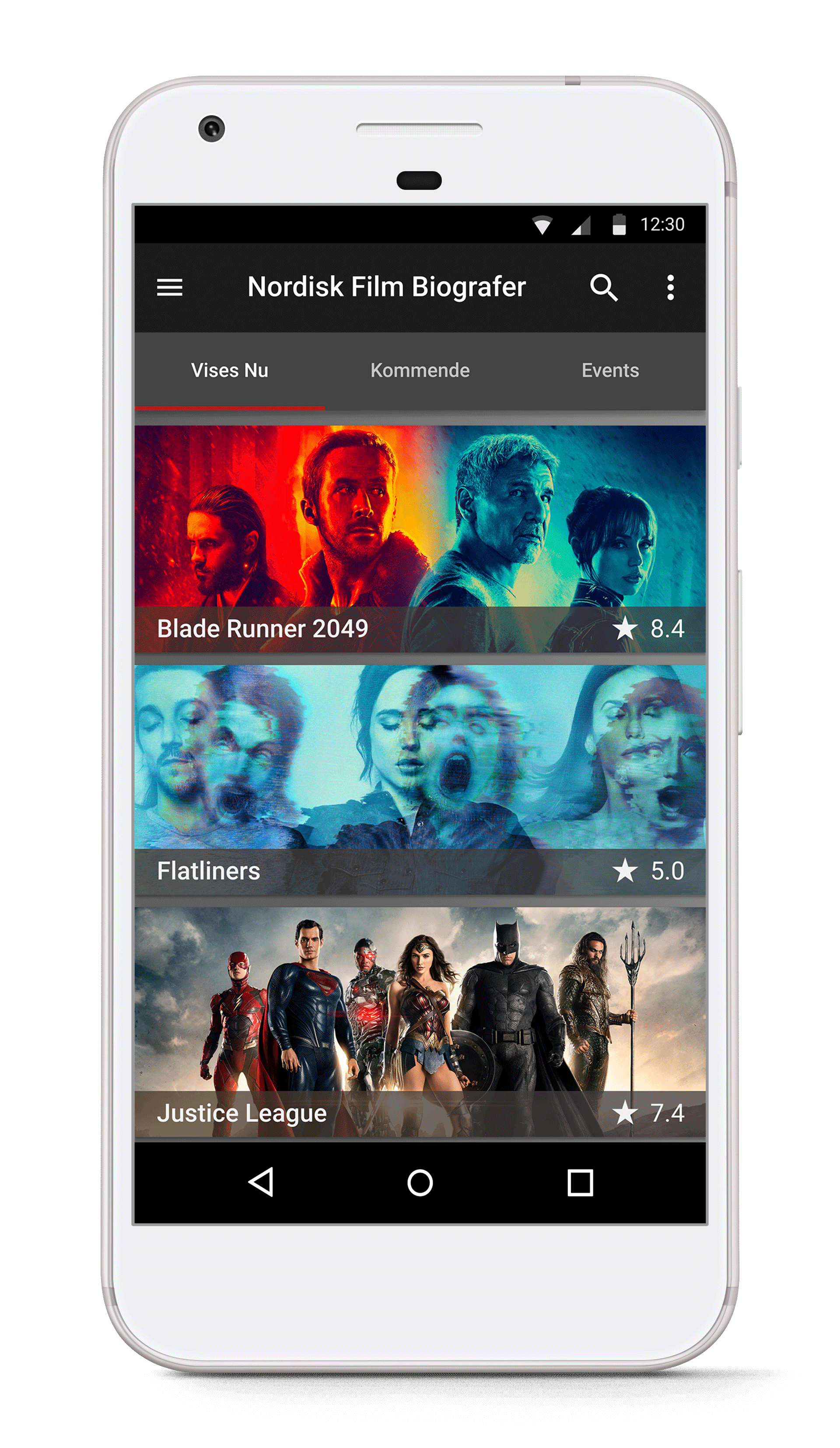
Scenario 1:
"Which movies are showing on Sunday?"
Scenario 2:
"Reserve three tickets for specific movie"
Scenario 3:
"Which movies are coming out in October?"
Participant #1 2 2 1
Participant #2 3 2 N/A
Participant #3 3 2 3
Participant #4 3 3 1
Sum 11/12 9/12 5/12

Even with so few tasks and participants, this served as a good indicator of where to put most of my focus. Using this table as an outset, I arranged the issues that I observed on a priority list, going from high to low priority. Priority is based on how serious the issue is for the user experience, and for the bottom line of the Nordisk Film Biografer.

A picture of the most prominent issues, on post-its

This is where the case study gets into the nitty-gritty, explaining all of the issues I found relevant and how to solve them. It is the longest section, so I fully expect you to skim it over. If you want to skip straight to the next bit, click here.

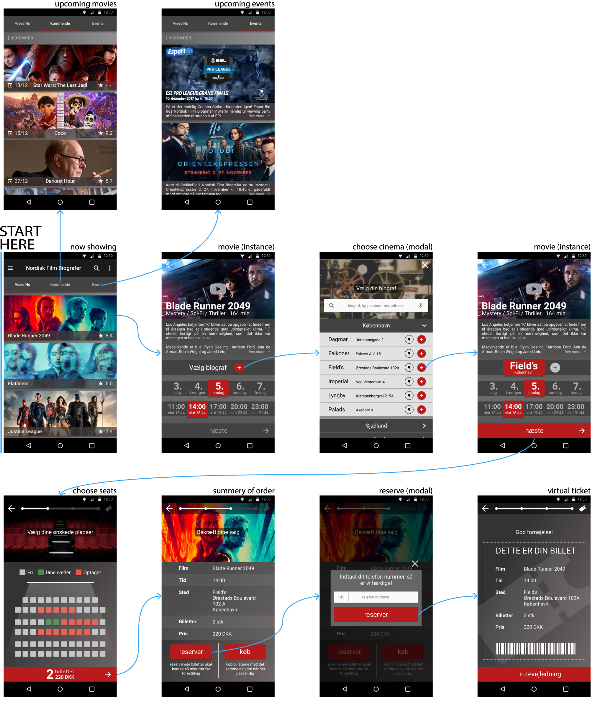
1: Ticket buying progress resets after logging in

After specifying movie, date, time and cinema, if the participant was not logged in beforehand, all progress would be lost.

This was the case for all participants. I later checked on several devices and browsers, and the issue persisted. I judged this issue as the most severe because it happens at the very last stage of the process, and then throws users back to start from square one, with no real explanation as to why. I will strongly argue that this issue has a direct impact on the amount of people who complete the ticketing process.

A picture of the most prominent issues, on post-its

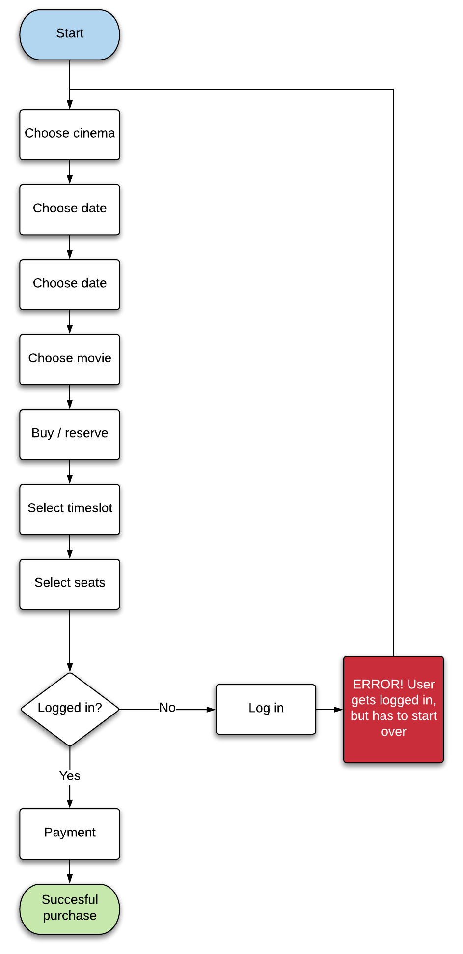
Edit: This issue has since been fixed on their live website.

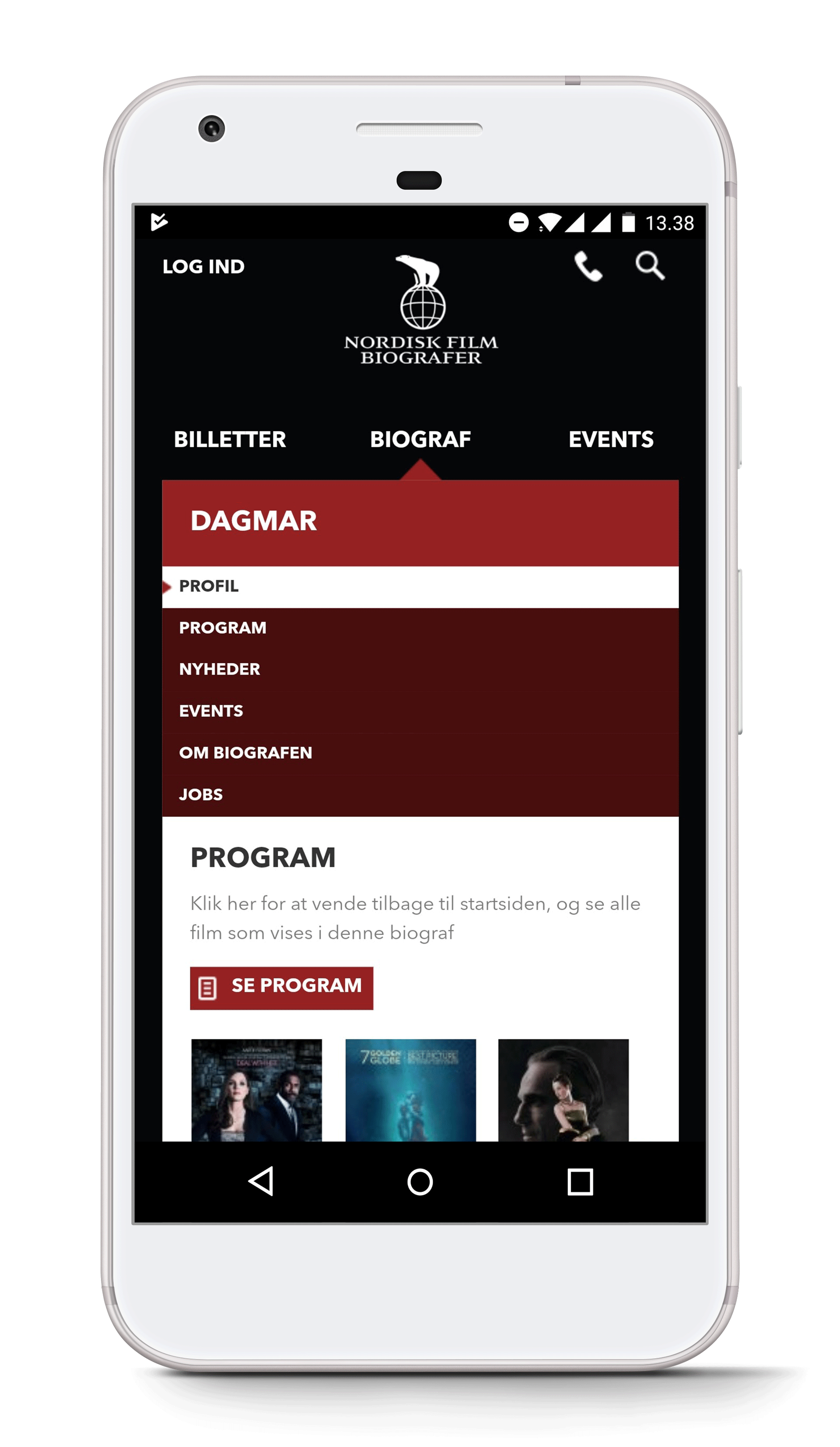
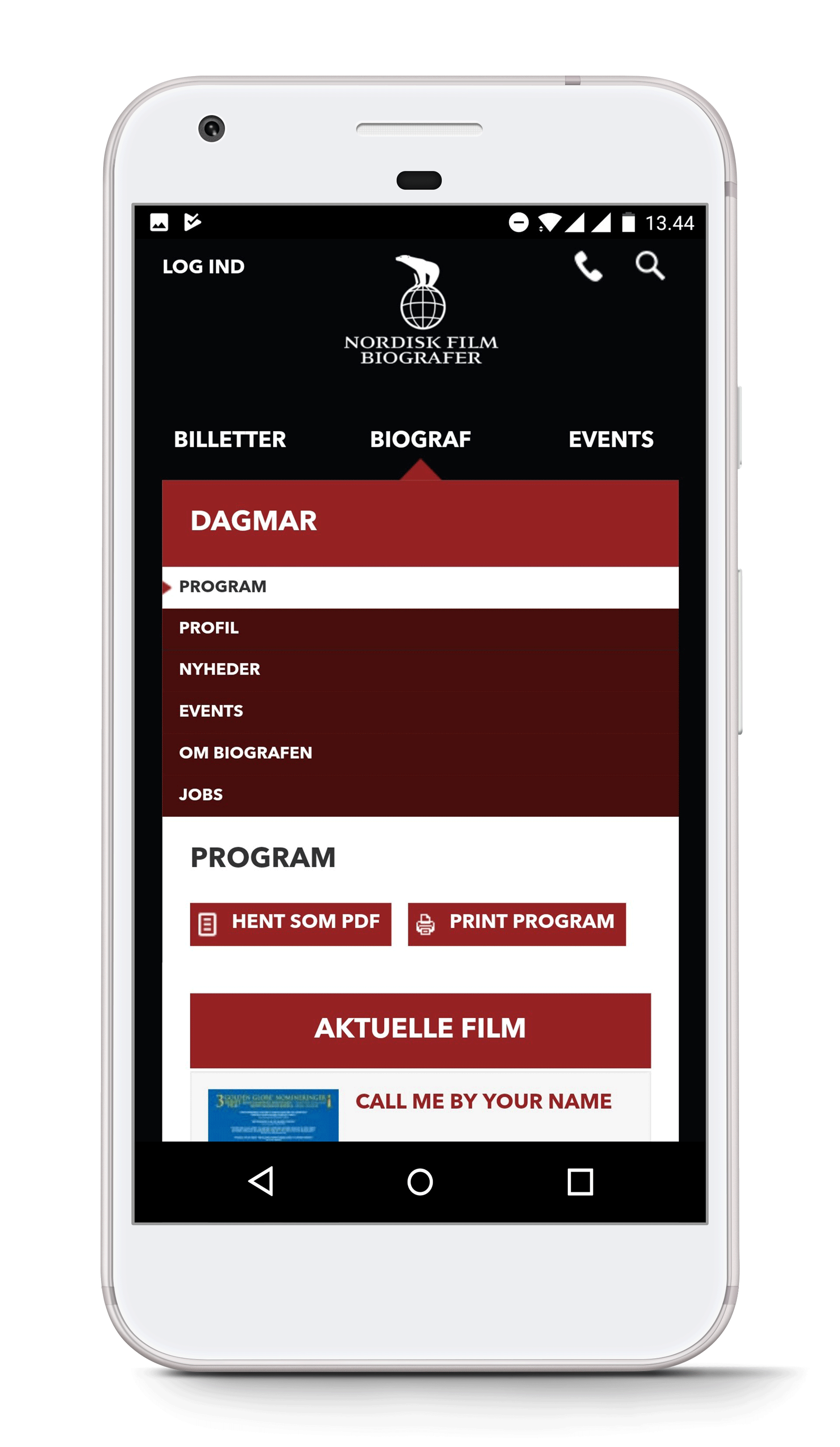
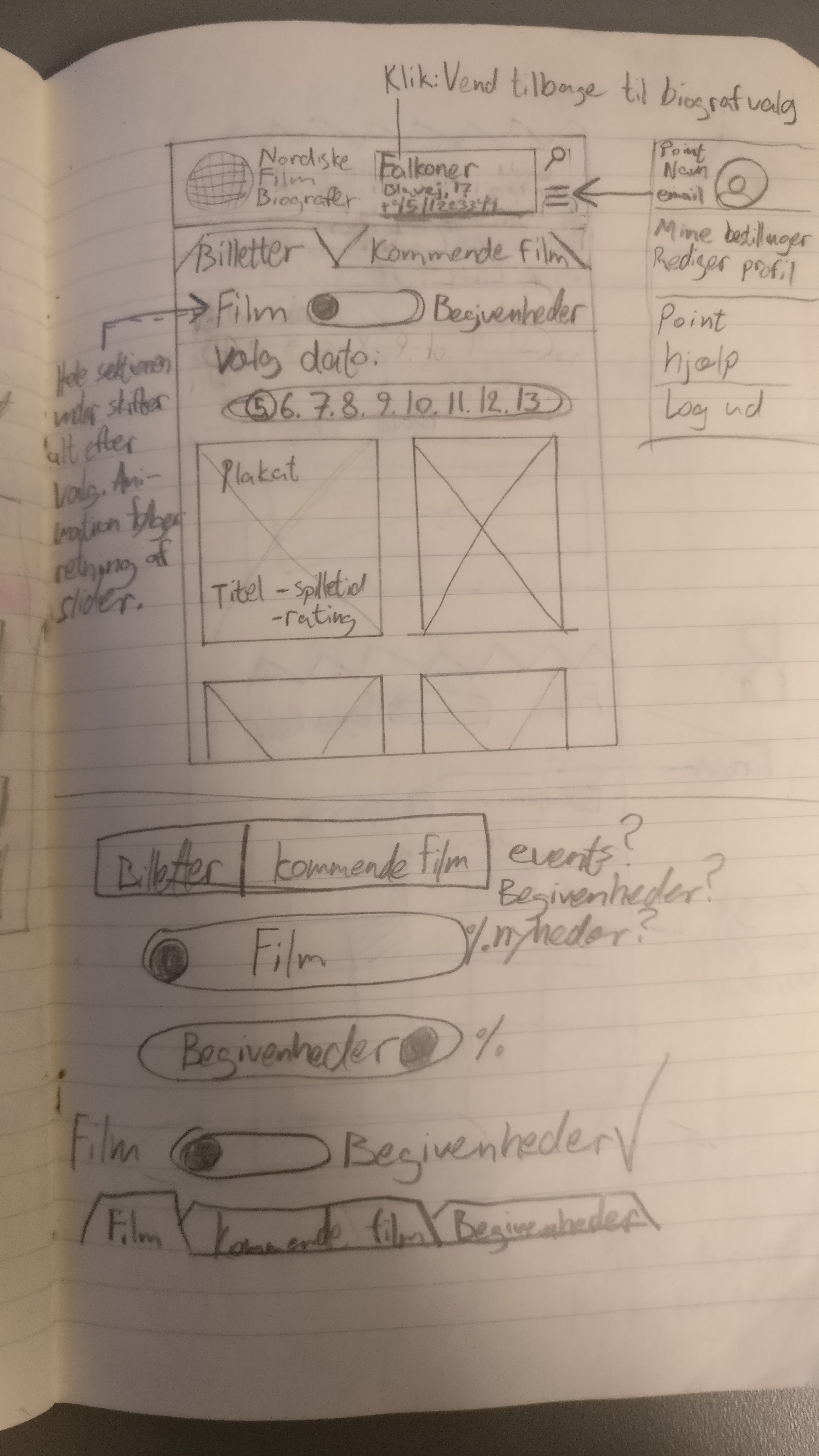
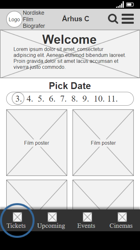
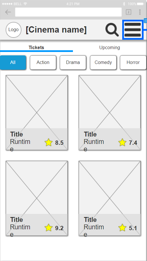
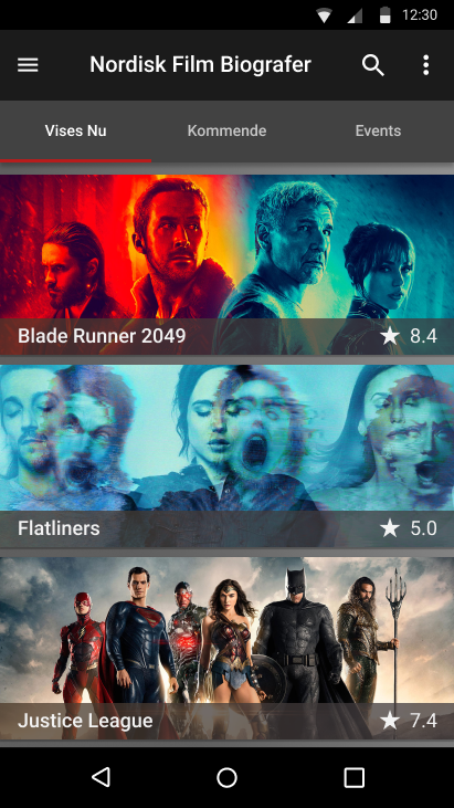
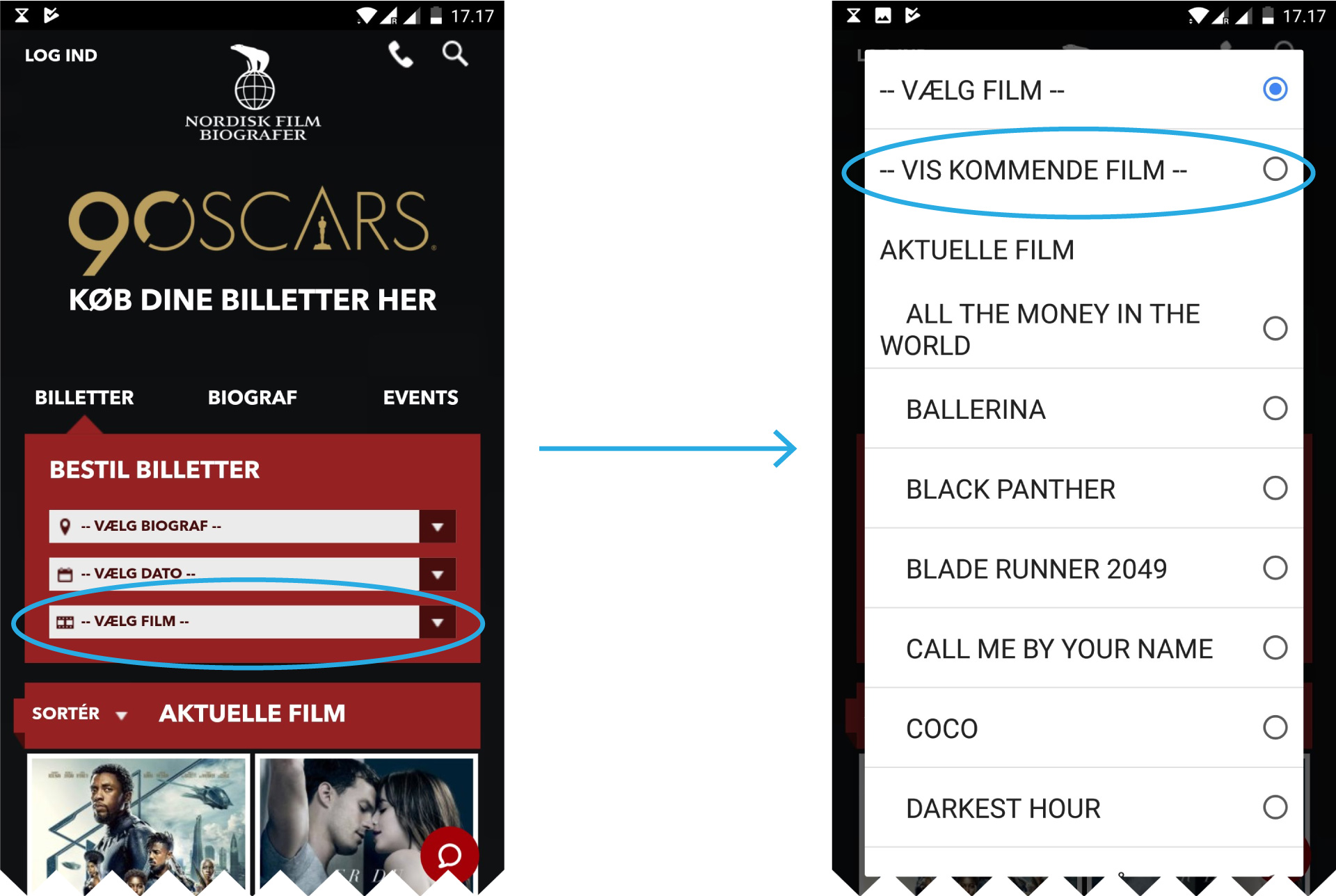
2: Upcoming movies are hard to locate

The navigation item that takes users to the “upcoming movies”-page is difficult for the participants to find. One participant searched for 6 minutes and another for 3½ minutes before I stopped them, as I sensed their frustration.

"I just can't find it"

one participant said very plainly, confirming what I had already observed twice before.

Funnily enough, I also failed to locate the item when I was asked to reveal where it was after the test by a participant. It was only later, when I went through my notes, that I was able to find it.

The page is reached by clicking a very ambiguous item in a drop down menu labeled “select movie”. This drop down is the third consecutive drop down in a column, after “choose cinema” and “choose date”.

I asked the single participant that had found it without issue, how she had done it. It turns out, she had taken note of the item during a previous task, and remembered it.

Seeing as the act of checking future releases turned out to be in the top 3 of reported goals in the preliminary research, this needs to be much easier to locate.

A fast and cheap solution to this would be to relocate the menu item, perhaps as one of the tabs at the top of the site.

Problem

A picture of the most prominent issues, on post-its
  • A high level menu item is hidden away under a dropdown menu
  • The menu item is not very visually distinct from the rest of the items on the list
  • The menu item is grouped with movies, not other menu items

Solution

A mockup of a possible solution to the issue of the page named upcoming movies being overlooked.
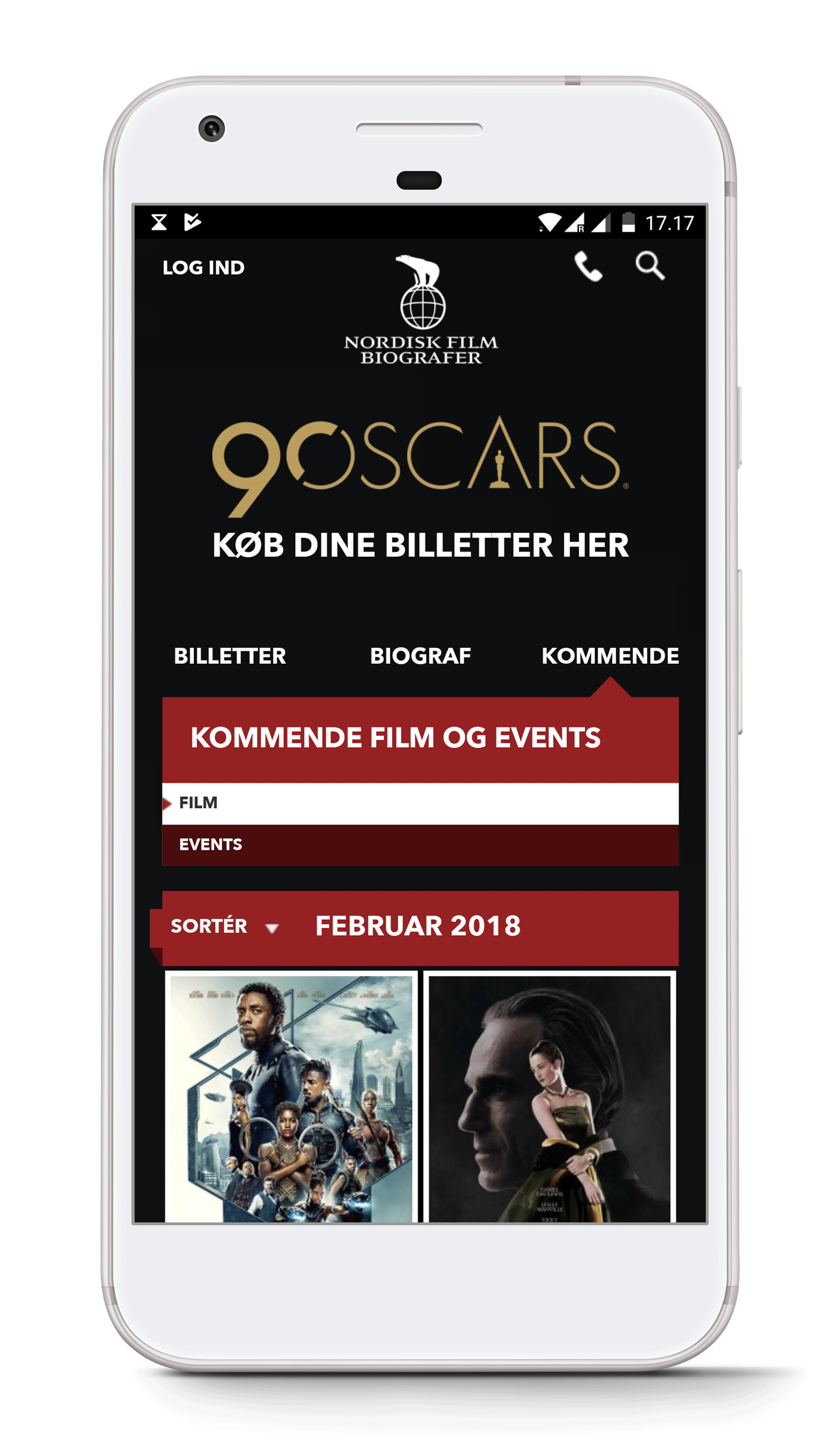
  • Group "upcoming movies" with "events" and put them under a tab called "upcoming", replacing "events"
  • The grouping seems more intuitive
  • Participants would consistently browse the tabs when searching

If resources are not an issue, the best solution could be determined with an open card sort. This would also likely lead to more intuitive information architecture, overall.

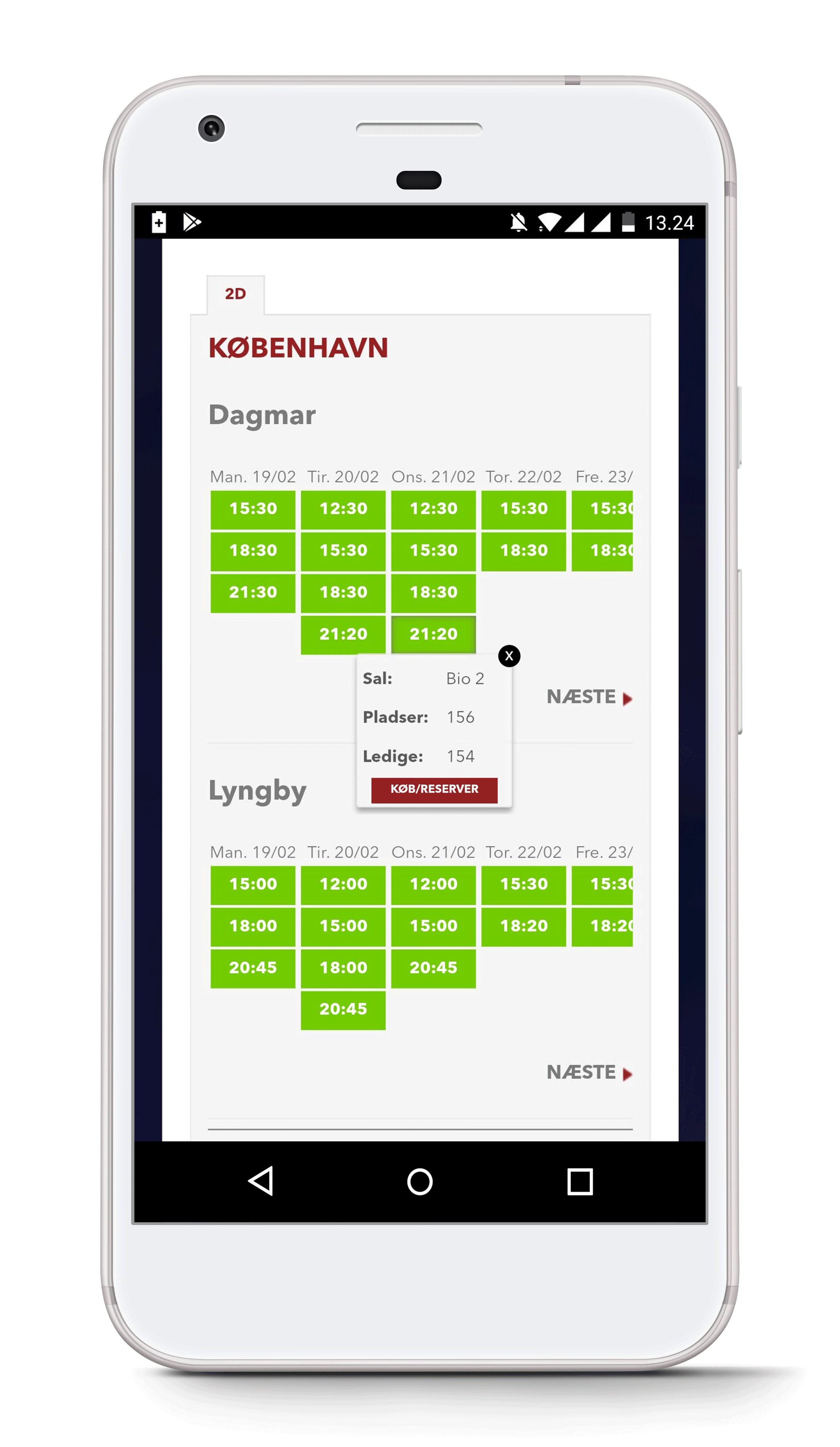
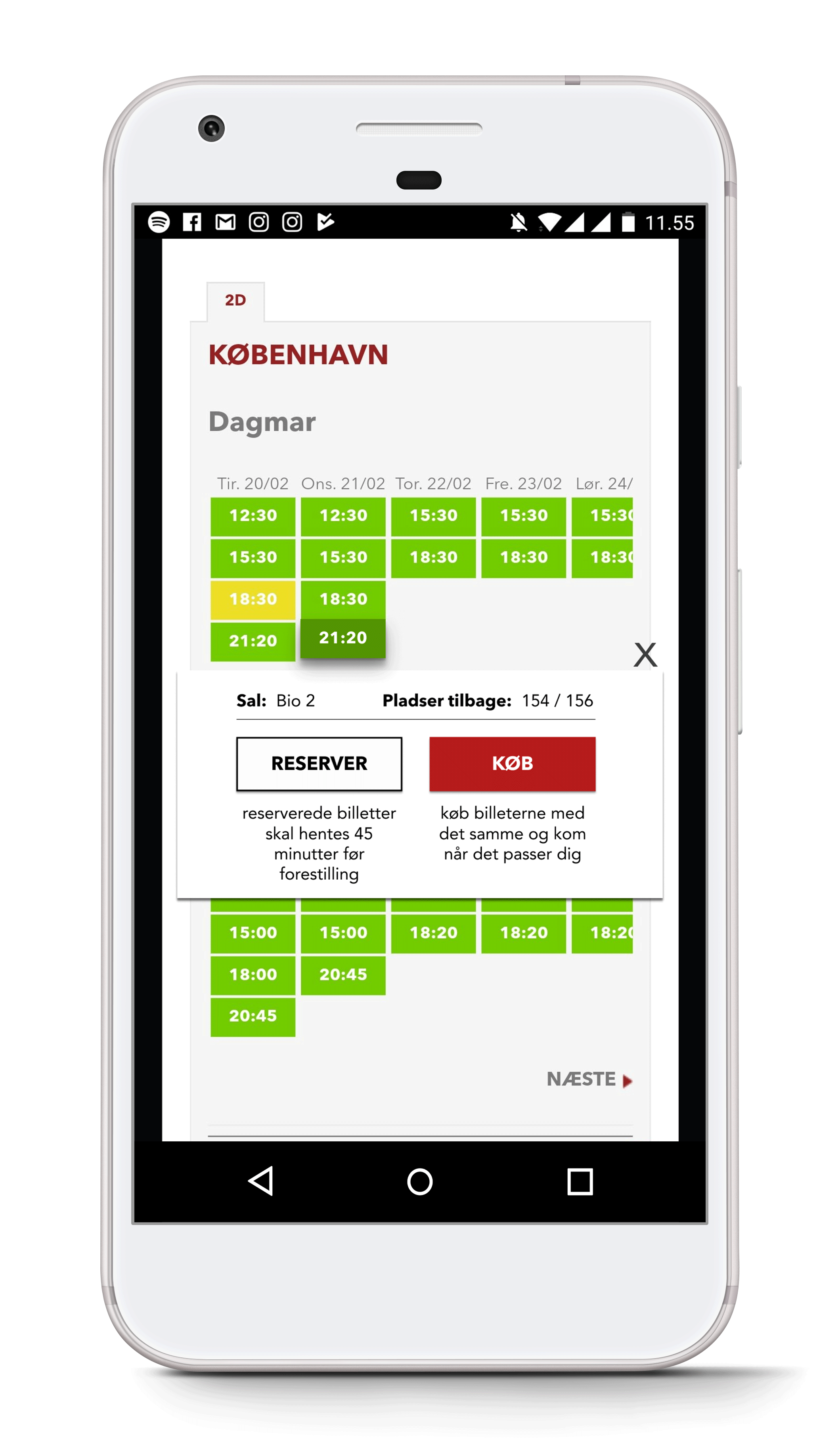
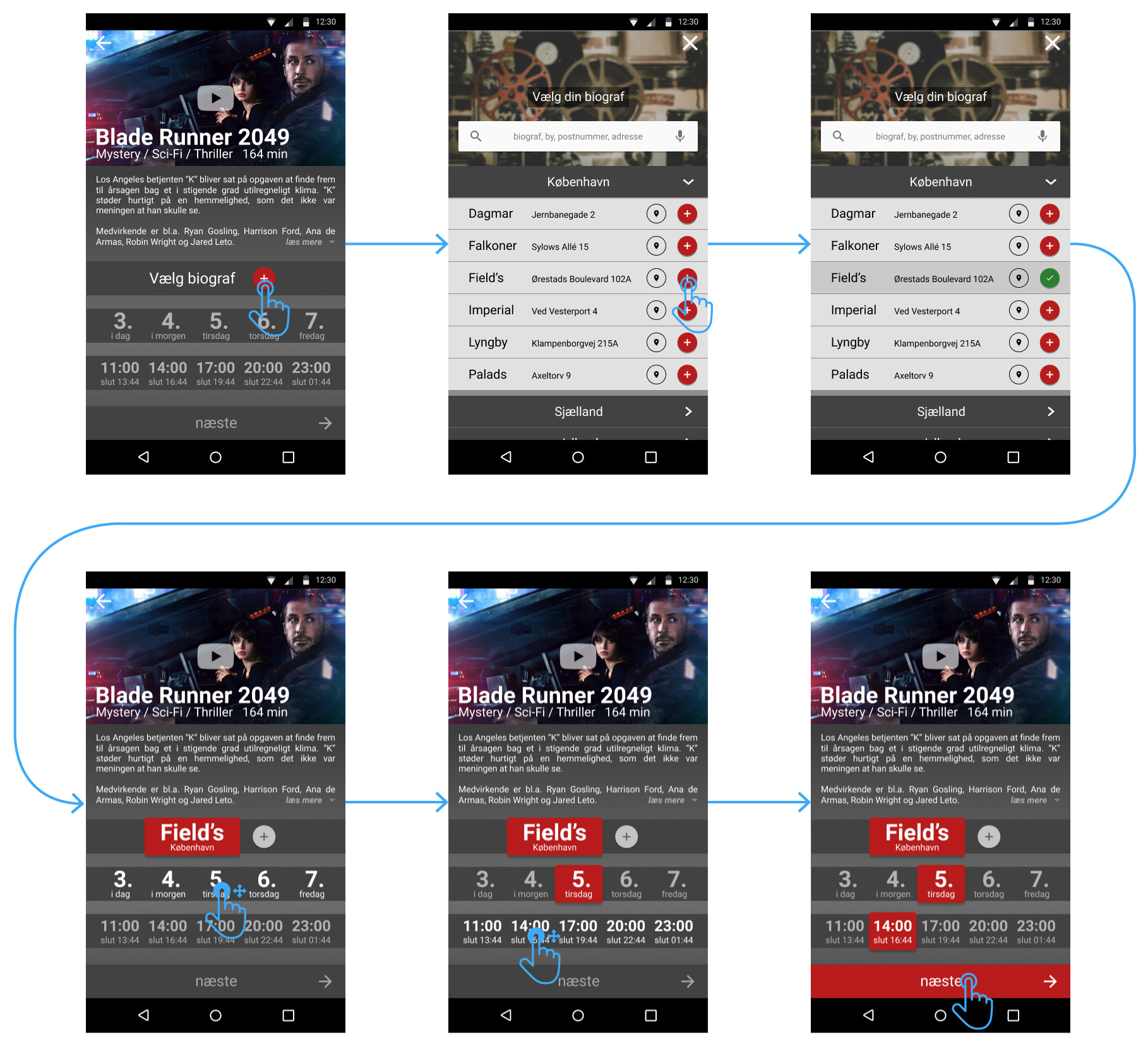
3: The “buy / reserve” dialogue box is ambiguous.

After selecting a movie, a panel about the movie expands (vertically) and elements outside of the panel darken. Good, this draws focus to the foreground elements. Unfortunately, it goes downhill from here. To buy or reserve a ticket, the next step is to select a show time, but the panel is very convoluted, and the show times are not visible until you scroll down. There are 5 different red rectangular buttons screaming for attention, none of which are actually the button that takes them to the next step in the process. If they scroll down, they eventually see the movie show times for every cinema that shows this movie, which can be as many as all 23 of them.

When clicking a time, a dialogue box appears with a single button that says: “buy / reserve”. The dialogue is about 1/9th the size of the screen, and the same background color and hue as the elements behind it.

This entire panel is an issue. Participants scrolled up or down, uncertain if this was the step they should be taking next. There is too much going on, and the design does very little to lead them.

A mockup of a possible solution to the issue of the page named upcoming movies being overlooked.

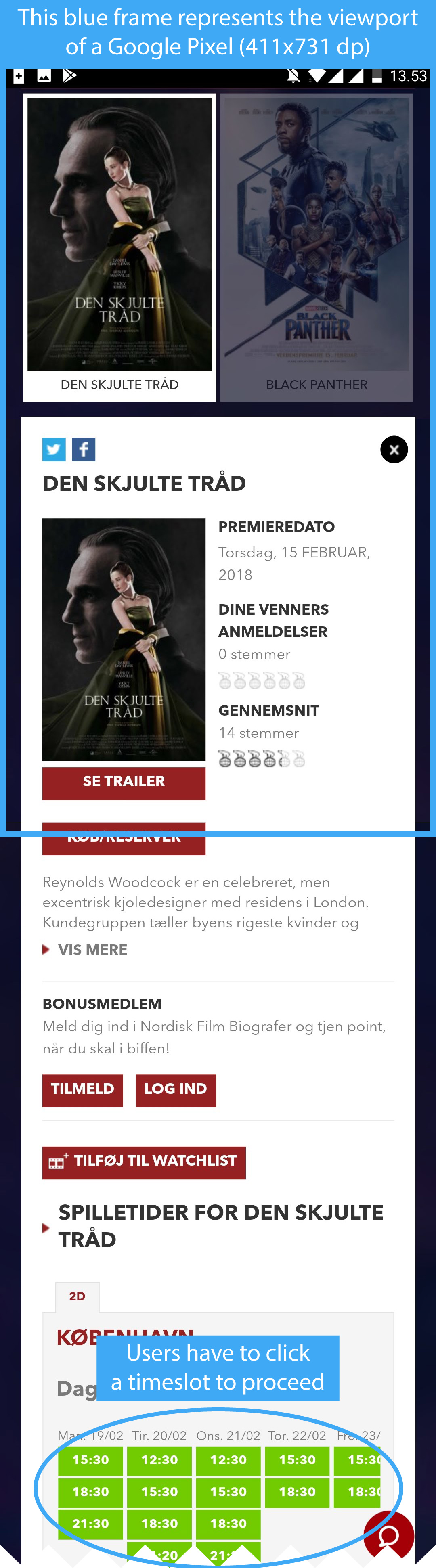
A fast and cheap solve for this is to reduce the amount of buttons and possible actions in the panel, or even to make the second dialogue much larger and more prominent.

Problem

A mockup of a possible solution to the issue of the page named upcoming movies being overlooked.
  • There are too many buttons and too much information
  • Popup gets easily missed
  • Buy and reserve are not explained here, nor later in the flow
  • The selected time slot is very subtle

Solution

A mockup of a possible solution to the issue of people missing the buy / reserve modal
  • Reduce the amount of information and actions possible
  • Make the pop-up dialog much larger
  • Explain right there and then what reserve and buy do different
  • Make the visual cue for selected time slot much clearer, potentially with depth

The better solution would be to restructure the panel, so that the show times are immediately visible, and generally strive for a better visual hierarchy.

4: The “cinemas” tab confused some participants

I observed a few instances where the participants would choose to press the “cinemas” tab, instead of using the drop-down menus on the “tickets” tab.

People would then stay here for a little while, scrolling up and down, not quite sure how to progress.

There are six menu items (some of which are redundant), three unrelated movie posters, and a carousel that advertises the upcoming events for this particular cinema. “Program” is among the menu items, and there is also a separate “see program” button visible under the headline: “Program”, immediately following the menu.

So if they are so plainly visible, why do people not see them?

What the participant expected was to see the program for the cinema, front and center. They scan the page, hoping to see images of movie posters that they can click on, or another dropdown menu for movie selection. The problem is made worse by, again, poor visual cues. White text on red is a button, but only sometimes. An indistinguishable interaction pattern makes scanning very hard.

The quick fix here is to simply put the program as the main item of the submenu.

Problem

A mockup of a possible solution to the issue of the page named upcoming movies being overlooked.
  • The participant is trying to find a movie, and expects the movie selection to be appear after selecting the right cinema
  • Instead, information about location and operating hours are the first point on the menu

Solution

A mockup of a possible solution to the issue of people missing the buy / reserve modal
  • Switch the first and second menu items
  • This makes the first menu item "program", which shows the movies currently playing

The better solution would be to distinguish the buttons with clearer signifiers, so that users immediately identify their options when landing on a new page.

5: Pressing “next week” when browsing by date only moves the view three days at the time

This is quite a small issue, and likely stems from the fact that the website hasn’t been developed mobile-first.

When browsing by date, the button says “next week”, but only moves as many days ahead as can fit on whichever device is being used.

“Isn’t Sunday part of this week?”, one participant asked, hesitating to press the “next week” button when the view was only letting her see as far as Saturday."It is a little confusing that it only shows 3 days at the time", they elaborated.

The simple fix is to change this to just say “next”, which they have done since I conducted the test.

6: “Events” is unclear.

While I initially categorized this problem as “medium priority”, based on the fact that one of the main navigational tabs could be misinterpreted, I later choose to re-categorized this issue to “low priority”. The reason it is now less important is because the confusion was only mentioned once, and by only one participant. The confusion presumably stems from the word being a foreign language from Danish, but the way she phrased this was ambiguous. She could has well have understood the word, but never have heard of a cinema holding events before.

7: The “buy/reserve” dialogue glitches

When you click a show time twice, the “buy/reserve” dialogue will disappear, and pressing the desired time again will not make it reappear. For it to reappear, you have to click another time first, and then the intended one, or reload the page.

This happened only once during the test, which is why I deemed it low priority.

In conclusion...

Based on working with the website, I feel like a lot of their issues boil down to

Visual clutter: on many pages, it is simply the case of the website trying to cram everything onto a page. The current state of the visual hierarchy makes it very difficult to scan each page, and CTAs get lost in the mess.

Indistinguishable actions: in way too many cases, actionable items would be indistinguishable from the rest of the page. Furthermore, there is a distinct lack of consistency. With only vague distinction between static elements and actionable items, it is difficult for users to even know what can be pressed and what can't.

Too many buttons!: seriously.

Confusing IA: the structure of the website, even after working with it for months, still confuses me. There is the distinct feeling of being lost when navigating, and no sense of ones progress when going through the steps of purchasing a ticket.

I have provided possible solutions based on the problems that the usability test revealed. This guerrilla test would be an excellent precursor to more extensive testing of the current website, but that isn't within the scope of my project. Instead, armed with new-found knowledge, I decided to try my hands at redesigning the website.

The Redesign

Now, there are plenty of arguments as to why a redesign of the website isn’t entirely necessary. Resource-wise, I have given fairly easy solutions to all of the usability issues that I found. I wanted to do a redesign in order to teach myself how. That is, after all, what this entire project is about.

The best way to do design anything, is to test with your users throughout an iterative process. At each iteration of the project, I consulted with more experienced designers through different online communities. I went through 3 iterations before landing on a final design.

Early sketch

A mockup of a possible solution to the issue of people missing the buy / reserve modal

1. iteration wireframe

A mockup of a possible solution to the issue of people missing the buy / reserve modal

2. iteration wireframe

A mockup of a possible solution to the issue of people missing the buy / reserve modal

Mockup

A mockup of a possible solution to the issue of people missing the buy / reserve modal

The redesign is a web-app, built using Figma (though I used Axure for the two iterations of wireframes). The resolution is 411x731 dp, which is the resolution of a Nexus 6 or Google Pixel. I chose to design a web-app, based on the assumption that Nordisk Film Biografer would like a one-fits-all solution. By choosing a web-app over a native app, you can make your solution scalable and independent on OS. The cost of maintenance is also drastically reduced.

In order to limit the breadth of the project a little, I decided to focus on the user flow for ticket reservation / purchase. I put my focus there, because it is likely to be the most important flow for the business objective of the company. Secondarily, I wanted to flesh out the features necessary for users to achieve the 3 most common goals revealed by the preliminary research.

A mockup of a possible solution to the issue of people missing the buy / reserve modal

Design decisions

I decided to stick with their existing color scheme. The dark design fits well with a cinema experience, and the red (though a tricky color in designing for the western world) reminds me of the color of show curtains.

I wanted there to be less visual clutter on the website, and for it to be obvious to the user what interactions were possible. For that reason, I used red as the primary color for CTAs.

On the original website, the "next step" when ordering tickets was hard to find. You had to scroll down (and back up, as observed in most cases, during scenario 2 of the test) to find the right button. For that reason, I decided to make the screens in the ticket flow fixed in size, and place the "next" button near the bottom of the screen fairly consistently. The exception to this is when the user has to choose between "reserve" and "buy", because I wanted there to be visual distinction, to hint to the user that there was a choice to be considered.

The decision to make "choose cinema" a modal of its own, and not simply a dropdown, was a difficult one. My first arguement for the modal over a dropdown is certainty. The dropdown would have had to contain 21 cinemas, browsable by name, city or both. There would not be space for more than that. I forsee use-cases in which users do not know the name of the cinema closest to them, which is where the location pin and adresse comes in handy. By clicking the pin next to a cinema adresse they were unsure of, an embedded Google Maps widget shows them the location of the cinema. Click that, and it takes them to Google Maps, for further investigation. The second arguement for the modal is because I wanted to give the option to pick your favorite cinema, so that on next visit, it is already selected for you. Is that a good idea? Not sure! It is based on two assumptions that should be tested on next iteration:

1: Most visitors to the site already know in which geographical area they want to go to the cinema

2: In most instances, on a return visit to the site, people go to the same cinema that they did the first time

A mockup of a possible solution to the issue of people missing the buy / reserve modal

On the "choose seats" screen, instead of first selecting how many seats you want and then clicking, I wanted it to be possible to simply click (or click and drag) how many seats you want. The amount of seats and the cost is then displayed on the "next" button.

I wanted to make it obvious how long the process was. That can be difficult to display, because there are many different use cases. I added a progress bar at the top of the screen, once users had gone past the initial selection of place, day and time.

A mockup of a possible solution to the issue of people missing the buy / reserve modal

Prototype

As a part of the project, I put together a working prototype. The intention was to use it to test the ticket flow on the next iteration of the project.

Click here to try the prototype.

What this project has taught me

"Wait, that's it?" I hear you saying. I wanted to test my design by the same parameters as their existing website, but just as I was getting ready for the next iteration, I got invited to do some work with a local start-up.

This entire project was my introduction to a lot of new software and methods. The case study format felt a little familiar, reminding me of my time spent on academic writing. Being able to decide on the format was refreshing, going away from writing to academics to writing to people. That leads me into the first take-away:

Communication

UX is, in essense, about communication. Software and websites need to be able to communicate purpose, possible actions, restrictions and limitations to the target user (and then some). Conducting a good usability test is about communicating intentions, procedure and process, yet in language that eases the participant and makes it feel natural and fluid. Even writing this case study is about communication, as I tell you about my approach, my process, my hurdles and my findings. Even this very paragraph is about communicating what I have learned about communication. Woah.

I want to become a better writer, and continue to improve my skills in visual communication.

Planning

I had planned for the project to take two months, including writing this case study and making this website. Haha! Yea, I was a little off. The entire thing took 5 months in total, which made me feel ashamed, at first. But instead, let's turn that into a valuable lesson about planning, shall we?

I think I could have been more realistic in planning the project if I had spent more time planning each stage, instead of just defining them and then diving head-first into it. Part of the reason it took so long was because I had to learn every step along the way, from testing to coding HTML & CSS. Having now gone through every stage, I feel like I have a much better understanding of what goes into developing a product or service, from research to development.

If this project has taught me two lesson, it's to take smaller bites. and be less thorough. If I had moved faster with less regard for my own assumptions of "correctness" when it came to designing the structure of the redesign, I would have been able to iterate more effectively and thus, improve the design.

Persona

I had intended to work with a persona, and I went through the steps of creating a proto persona from the very limited data that I had managed to gather. The guerilla tests largest weakness is that it doesn't really allow for you to handpick your participants. My proto persona ended up being too vague due to a lack of data on the largest demographic (15-29 years of age), so I ommited it from the case study.

I now have a much better understanding of how to create personas, and the amount of work and data that goes into making them useful and truthful.

Test location

When I conducted my test, I did so in a grocery store. When people enter a grocery store, they usually have a very specific reason to be there, and they don't wish to be there longer than it takes them to finish shopping. That makes a grocery store a pretty bad place to try and coax people into giving you their time. Malls and coffee shops make much better testing locations.

Tools

I found that I really enjoyed working with Figma. The intuitive UI, the ability to seamlessly collaborate on the same project and the fact that it can be used in a browser, making it independent of OS are just some of the things that will make me interested in working in Figma again.

Though Figma is amazing tool that makes it simple to share prototypes, the animations that they allow are fairly rudamentary. I wasn't able to make the main tab views scrollable, and I wish that it was possible to animate interactions that weren't transitions.

Thank you for reading.